Contact Us
Interested in working together? Ok, you can send us an email at info@oxygne.com or give us a call on +447463612758
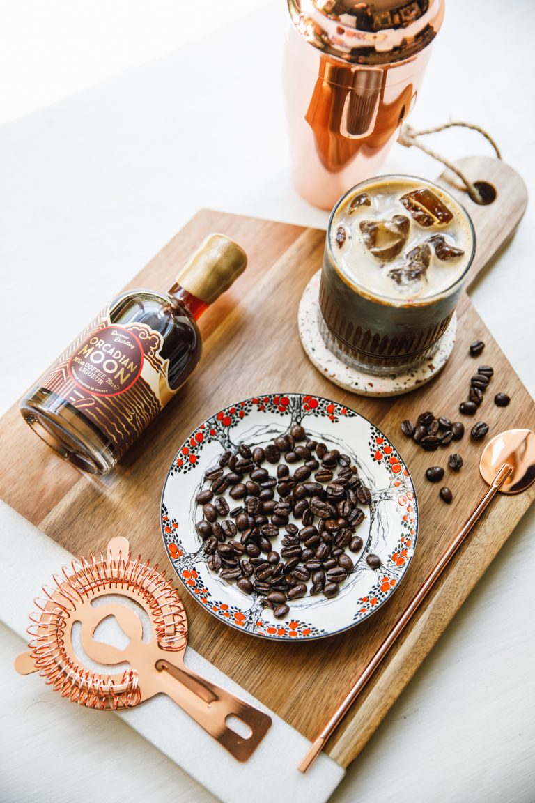
Deerness Distillery is a Direct To Consumer alcohol brand based in Orkney, Scotland. They sell Spirits and Liqueurs handmade from their distillery in Orkney. Despite already having a firm product offer, they struggled to scale their online sales and were trending negatively compared to the previous years.
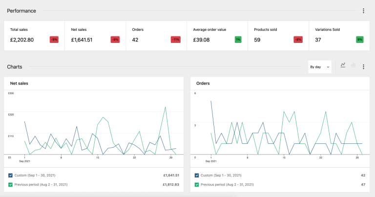
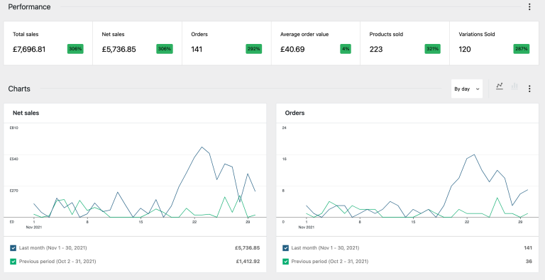
Facebook and Instagram were their primary source of acquiring new customers, and performance declined to £1641 net Sales in the last month before we took over the website management. Check out the case study to see how we turned it around and increased the net sales by over 6x in just the first after the launch of their new website.
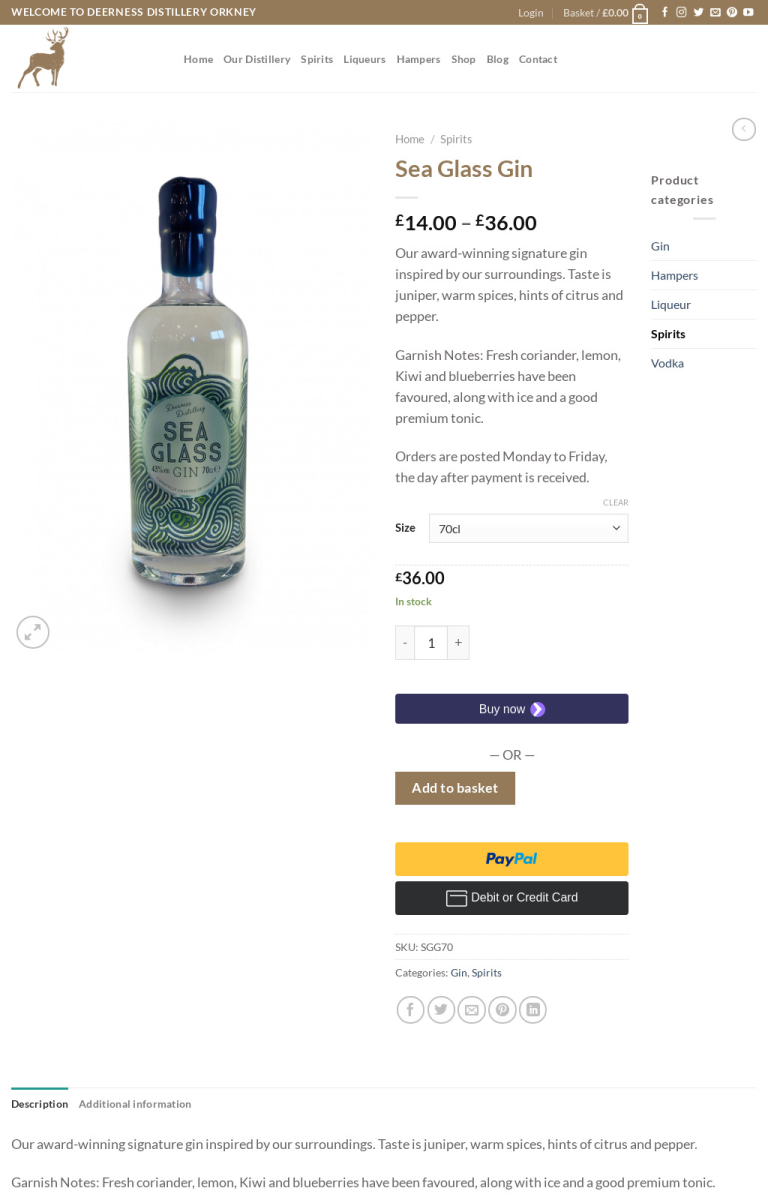
The first step to diagnosing their poor CVR was to take a look at their website. During this initial audit, we completed a heuristic and technical analysis.
We assessed each page for a set of 5 specific criteria:
We also conducted a technical analysis to detect technical bugs if they exist. It is the leading conversion killer because many eCommerce brands build their websites with no regard towards specific browsers and devices; this causes poor UX for a percentage of users. In addition to this, we did some fundamental site speed analysis to determine the current site loading speed.
During the analysis phase, we uncovered the following bottlenecks that were causing the decline in sales and poor ROI (ROAS):

Now that we uncovered the initial bottlenecks – how did we fix them and turn the performance around?
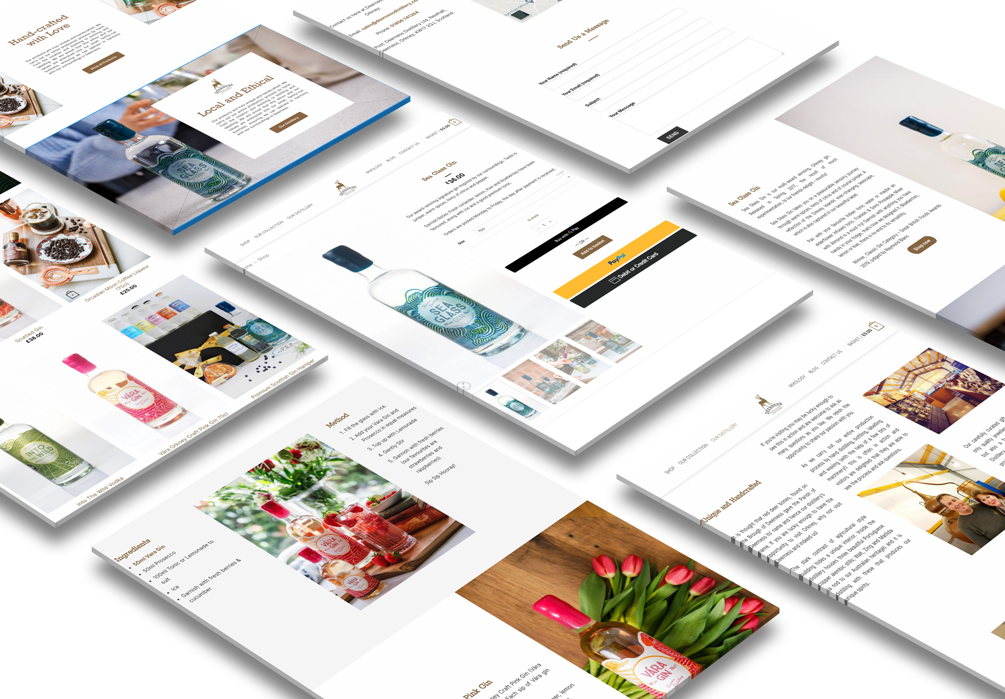
We went back to the drawing board and redesigned the main pages on the site that contributed to the sales; We wireframed every page to focus on the messaging. We structured every part of the funnel before proceeding to add any visual elements. Here are the following changes we made to web design:
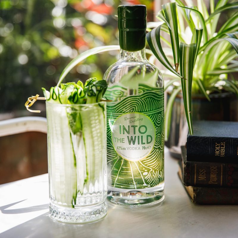
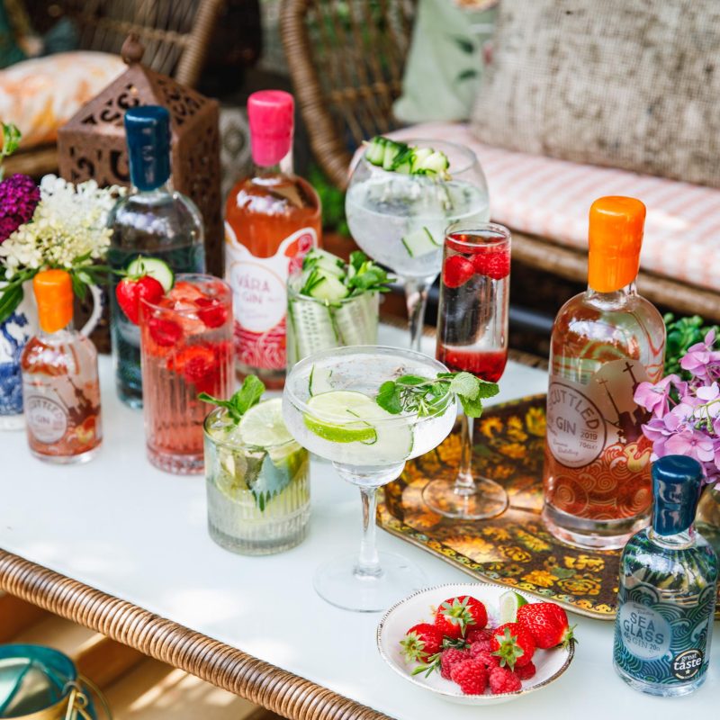
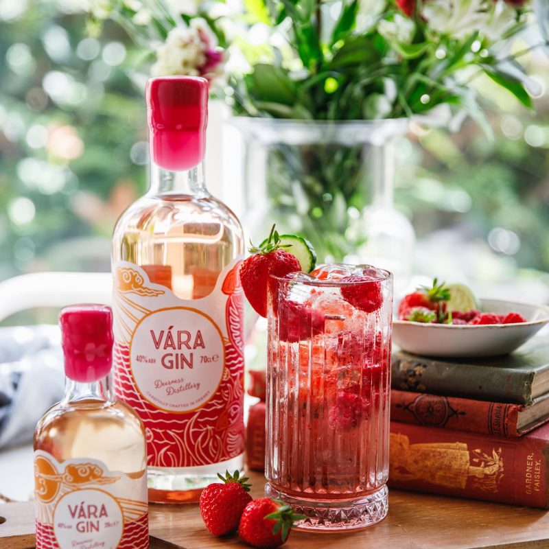
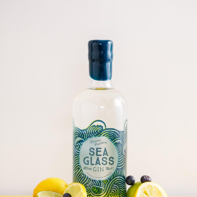
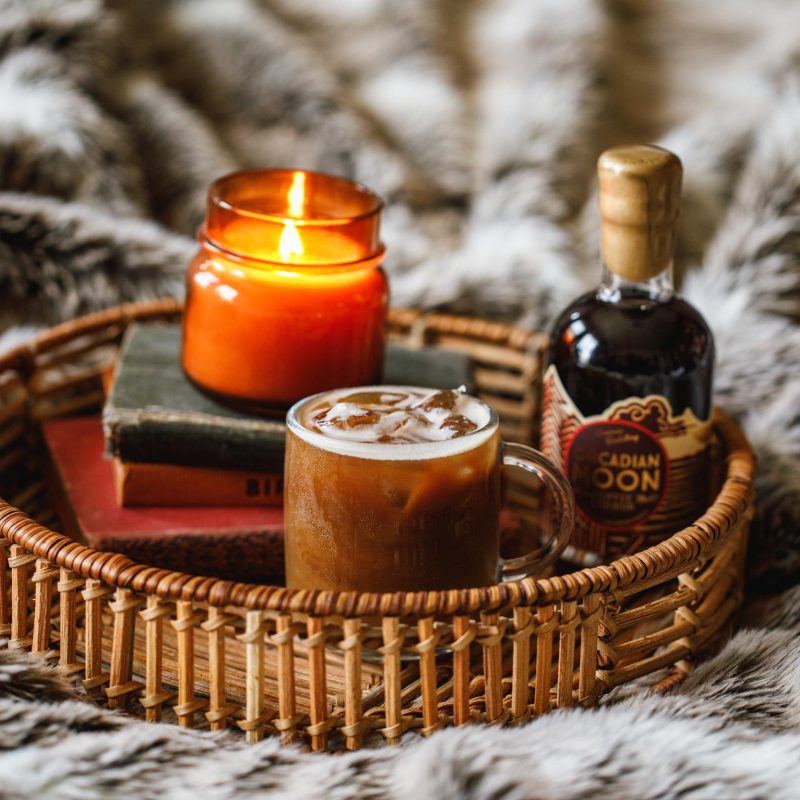
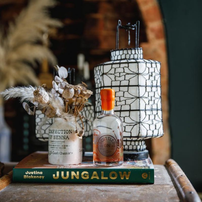
Used great imagery to create desire. Pictures are really useful tools of communication because you can create imagery that consumers can feel a connection with. Consumers that feel a connection with your brand imagery are more likely to purchase from the brand.
Introducing grid layout sections for consistency and breaking up the text into blocks. Breaking up text into smaller sections makes it easier to consume and also separates different ideas.
Used section headers to communicate the important message in each block of text. Section headers help to summarise the key message in a block of text for the readers that only want to skim the content.
Order the items in the Navigation menu by business goals priority; In this case, the business goal is to increase sales; therefore, starting with the Shop link is more appropriate.

Interested in working together? Ok, you can send us an email at info@oxygne.com or give us a call on +447463612758